Krizia
Reinterpret the identity of the iconic Italian fashion house Krizia
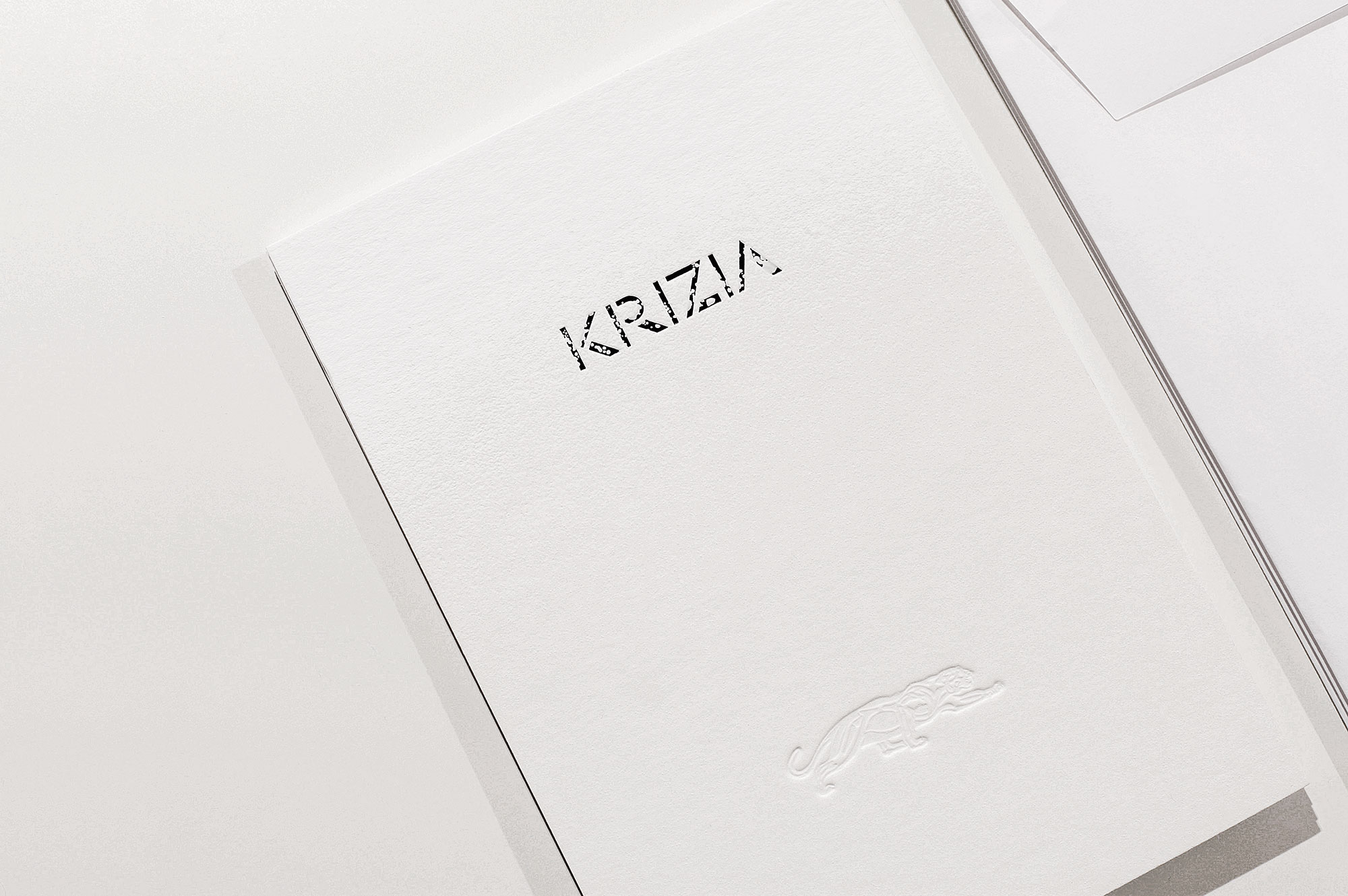
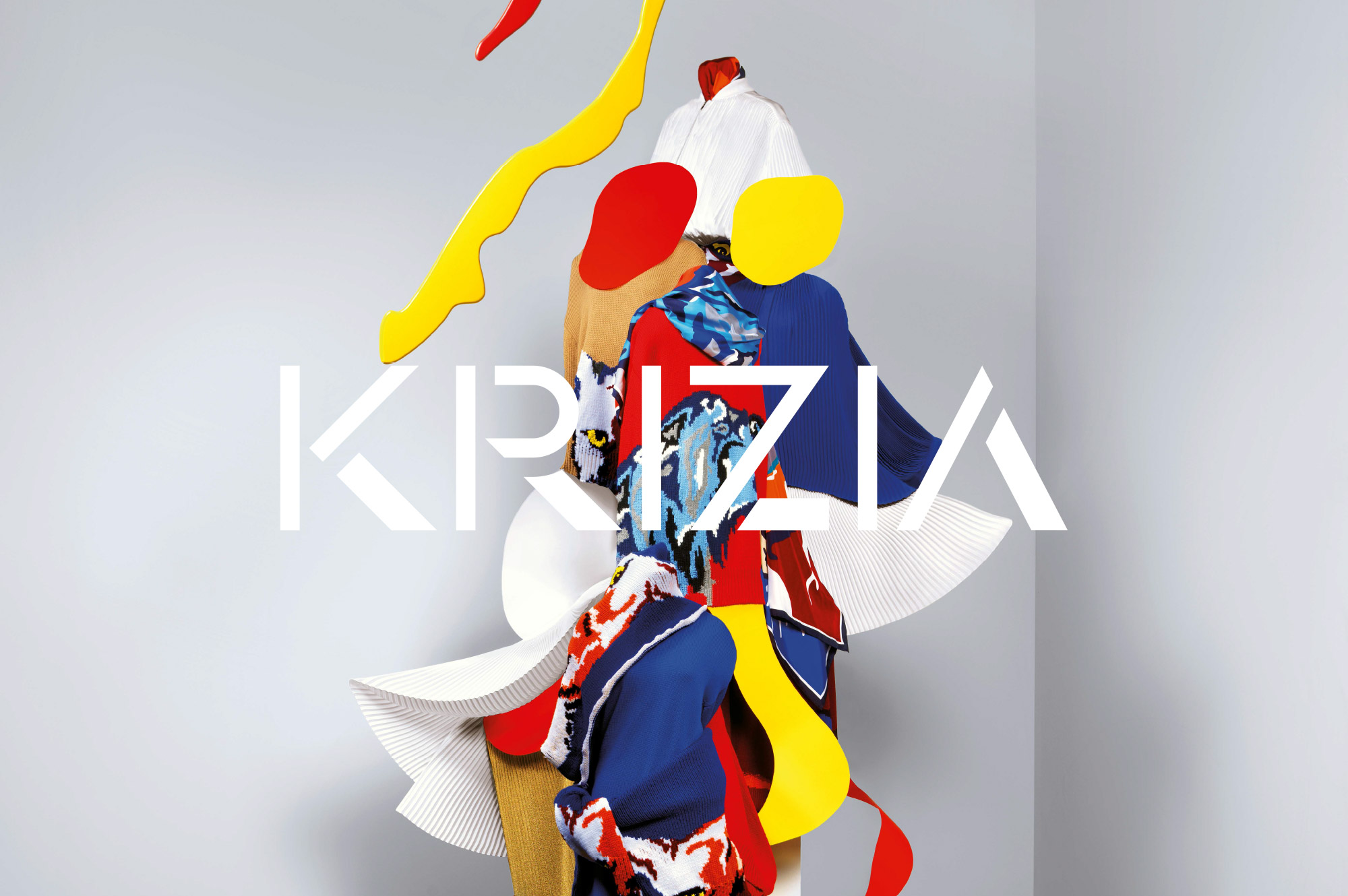
Think Work Observe teamed up with Agenzia del Contemporaneo to reinterpret the identity of the iconic Italian fashion house Krizia. At its peak in the 1990s, the ready-to-wear fashion label was established by Maria Mandelli in Milan in 1954. In 1964, with her first black-and-white collection at the Palazzo Pitti in Florence, which earned her a Critica della Moda Award, the label experienced a first major breakthrough; then Krizia rapidly expanded during the 1960s and 1970s becoming one of the most bold and iconic fashion houses at the times.
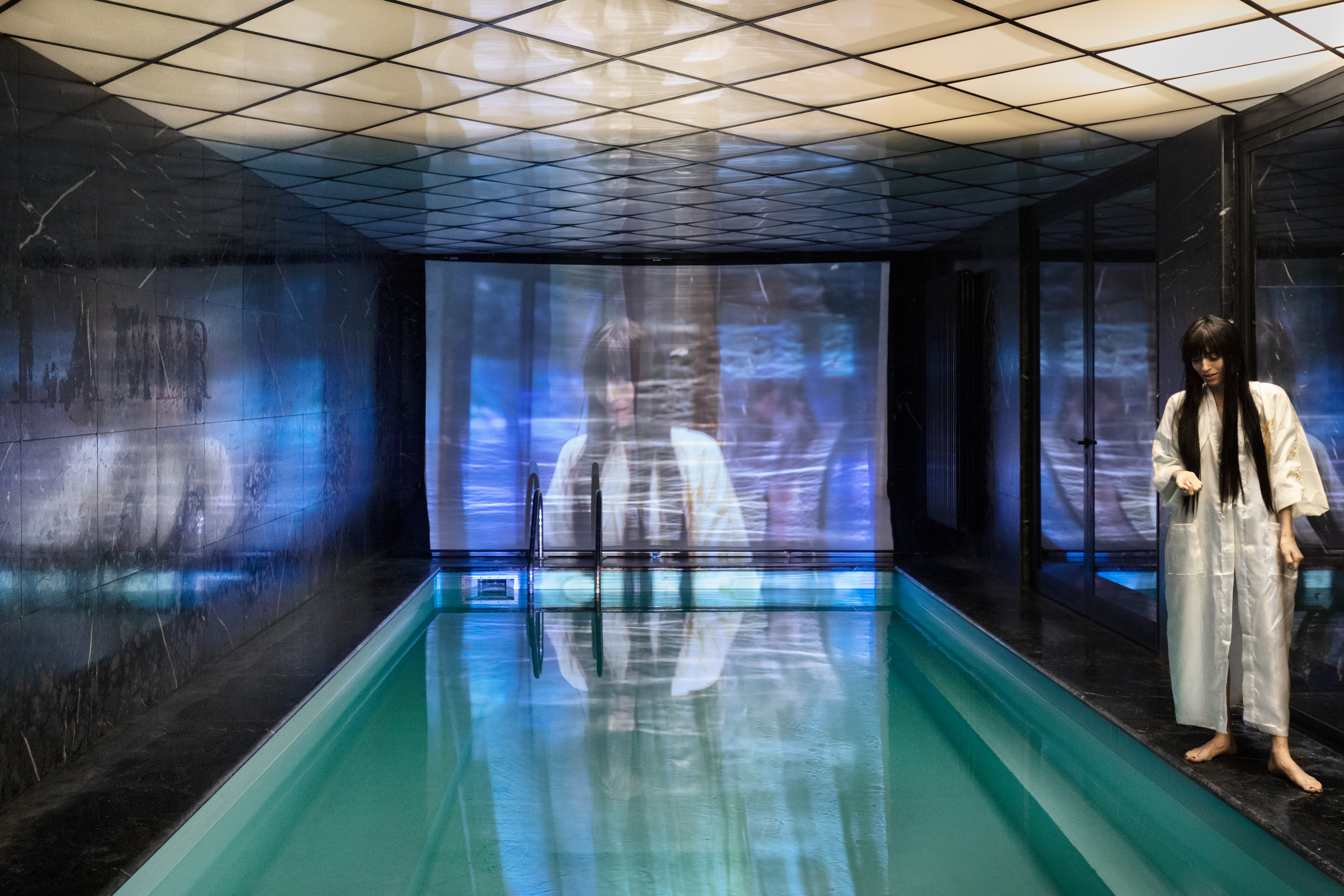
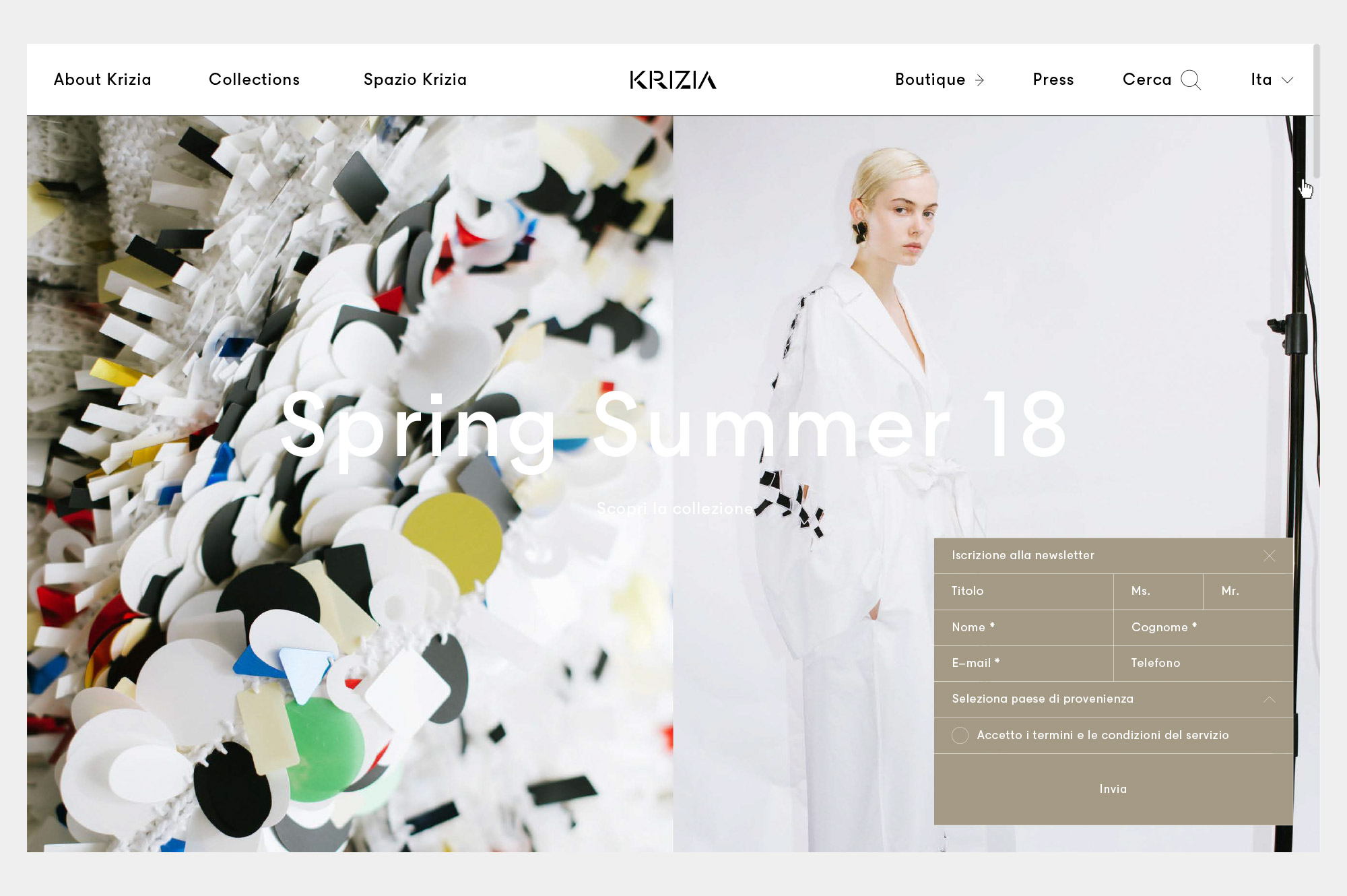
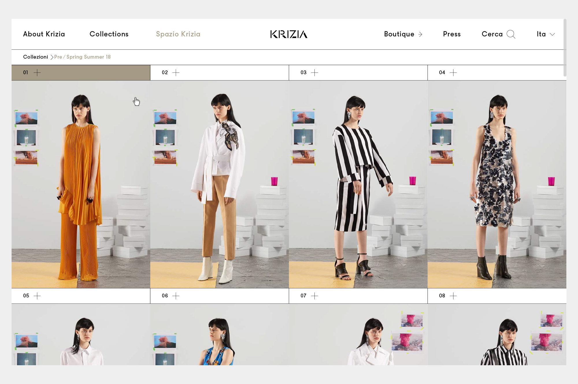
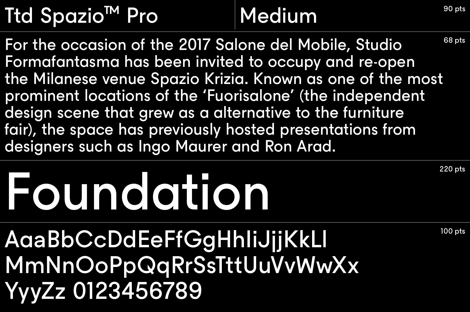
The original design of the logotype comes none other than Milton Glaser: we respectful approached this, considering in which way we could turn it into something actual but without losing its legacy. The result is something that reflect a new start for Krizia, with a careful exploration of the classic letterforms of the stencil alphabet designed by Mr. Glaser. Our work included the design of a new typeface, that we decided to use for the corporate identity of the new Krizia: Spazio Pro is a geometric sans serif, that match perfectly with the geometric logotype, constructed with pure geometric forms and with inner relationships that refers to the classic Futura the company was using at the moment. With the creative direction of Cristiano Seganfreddo, a new advertising campaign by Lorenzo Vitturi, the new videos by Italian filmmakers Adriano Valerio, Carlo Sironi and Irene Dionisio, a new website that will be launched in the incoming weeks, Krizia is back among the most unique and radical fashion brands.


Via Durini 24 — 20122 Milano, Italy
info@agenziadelcontemporaneo.com
T. +39 02 72013385
We transform projects in something unique. An alchemical combination between Art, Fashion and Design. A group of thinkers combined with architects, designers, fashion stylists, graphic designers, curators and artists find completed and multidisciplinary solutions in fashion, design and publishing industry. Agenzia del Contemporaneo working group is guided by Cristiano Seganfreddo, creative director and innovator, and Alessio Avventuroso, art director and designer.
Viale Milano 60, 36100 Vicenza
P.Iva e C.F. 03393750249 — All right reserved
